Beautiful creature design
I have two kids under 11 years old, so it is a given that I see more than my fair share of movies geared toward children. And really, as a designer there is a lot to enjoy in many of these films even for adults—especially if you love design, art or animation. What is more, there has been a sort of mini-Renaissance in this genre of kids movies. Many of these movies come from books such as the Harry Potter films, Lemony Snicket’s A Series of Unfortunate Events, and Bridge to Terabithia. They have a lot in common thematically (modern fantasy), feature tween-age protagonists, and share a similar visual aesthetic. And they also happen to be pretty entertaining.
When I was a kid there were tons of great movies in a similar vein such as Flight of the Navigator, The Dark Crystal, Labyrinth, and The Neverending Story to name a few. These were imaginative stories not driven by pre-existing material or toy sales that really inspired me as a child. The newer movies seem to be a spiritual continuation of this greatness, albeit with much improved special effects.
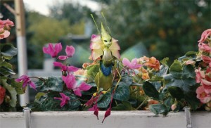
With that said, it came as no surprise to me that The Spiderwick Chronicles was another enjoyable romp through a childhood fantasy. What did comes as a surprise was a bit of creature design that really blew me away. The scene featuring the fairy sprites was just a few seconds of the film but I wished it had lasted much longer. Sprites in the movie were depicted as small creatures that moved much like insects but were anatomically like plants such that they could easily remain unseen in a bed of flowers. They were colorful, imaginative, and sort of floated lithely on the air. Despite this they were designed in such a way as to feel very plausible (at least as plausible as fairies can feel) in a design that naturally follows the rules of our world, if only with a small injection of magic—far more believable than the other creatures in the film (though they were largely charming). I loved that this part of the movie was completely under-developed, in fact the sprites did not speak at all. They were left mysterious and with the audience wanting more.
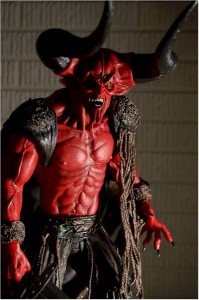
Still, it was the design that really got my attention. As designers we are often asked to design as system or within a system. Even the most simple of visual communication interacts with a system of visual cues that recall language or other bits of many means of communication. So it is exciting to see this in other forms of design and creativity. I always have admired excellent design of life forms that either align with life on Earth or completely made-up worlds. I think Jim Hensen’s worlds such as in Labyrinth or The Dark Crystal are great examples. In fact, most of Hensen’s work shares a base aesthetic. But I’m equally turned-off when it is done poorly. For example, the bad guys in Peter Jackson’s Lord of the Rings films were very unappealing to me. They were, for the most, part too slimy, too detailed, and lacking any of the appealing design that nature provides. Even the ugliest creatures on earth have a sense of proportion and elegance that the LoTR crew never captured. Maybe that was the point of the design—that they appeared to be alien to nature— but that disagrees with the source material, and me. I like even my bad guys to be beautiful, like the demon character in Legend (pictured, though this is a much later action figure version. I could not find a decent still from the movie); still one of my favorites.
If you’ve missed Spiderwick or any of the movies mentioned, here they all come highly-recommended, at least from me. And there are more. What are your favorite movies in this vein?

